Dalmark is an all-in-one Business Solutions company in Dallas, TX. All of our services are customized to your business needs. Everything from setting up servers to maintaining your computers and peripherals to building your entire brand from Websites to Business Cards.
Get In Touch
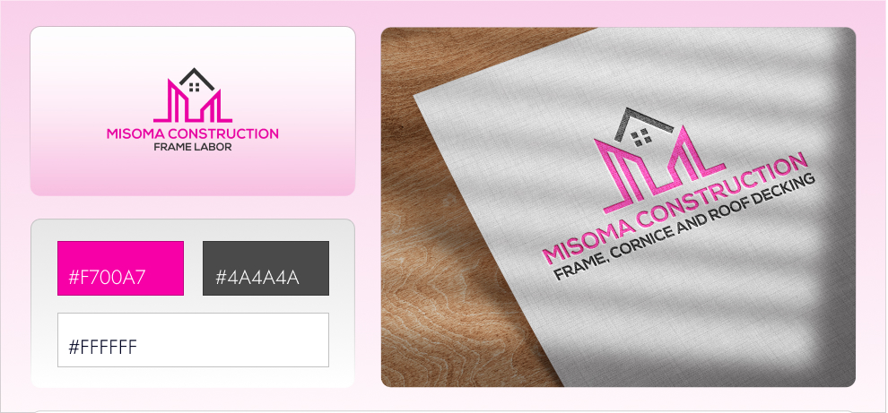
The designs for Misoma Construction LLC reflect a harmonious blend of trustworthiness and welcoming professionalism. Drawing inspiration from the core values of the company, we meticulously crafted a visual identity that resonates with reliability and warmth. The chosen palette of grey and pink symbolizes a balance between strength and approachability, while the deliberate embrace of sans-serif typography enhances readability and modernity. This thoughtful combination of colors and typography not only exudes an aura of trust and quality but also epitomizes the essence of Misoma Construction’s brand identity. Additionally, we designed a logo that encapsulates these elements, serving as a visual anchor for the brand’s commitment to excellence and customer satisfaction.
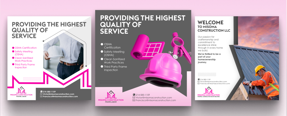
In our approach to social media design, we ensured that the brand’s visual language remained consistent and impactful across various platforms. By integrating the same color palette and typography, we created cohesive and engaging content that effectively communicates Misoma Construction’s message. Our designs for social media posts, banners, and advertisements were tailored to highlight the company’s projects, services, and achievements, fostering a strong connection with the audience.
Overall, this project case showcases our dedication to creating a unified and compelling brand presence for Misoma Construction LLC, reinforcing their reputation as a trusted and professional entity in the construction industry.