Dalmark is an all-in-one Business Solutions company in Dallas, TX. All of our services are customized to your business needs. Everything from setting up servers to maintaining your computers and peripherals to building your entire brand from Websites to Business Cards.
Get In Touch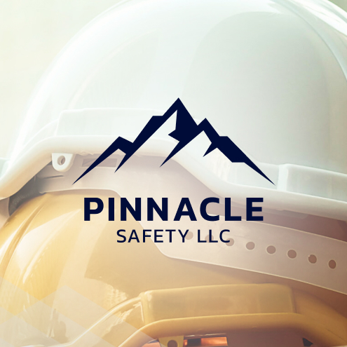
Crafting designs for Pinnacle Safety was an inspiring journey that combined professionalism with a strong sense of security. The inspiration behind the design stemmed from the need to convey trust and reliability, which are paramount in the safety industry. We chose a palette dominated by serious blues, a color often associated with trust and dependability. The use of sans-serif typography further reinforced the modern and professional look we aimed to achieve. Our design process included creating a cohesive brand identity, starting with the logo and extending to business cards. The logo was inspired by mountains, symbolizing strength, stability, and a solid foundation—qualities that Pinnacle Safety embodies. This mountain-inspired logo was designed to be both simple and memorable, ensuring it would stand out in the industry while maintaining a sense of seriousness and professionalism.

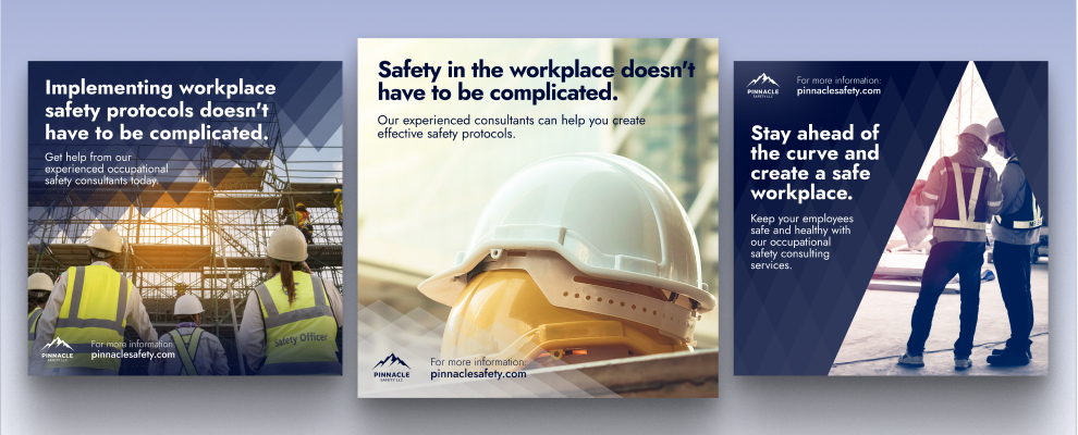
In addition to the core branding elements, we also focused on designing Pinnacle Safety’s social media presence. The social media designs were crafted to be visually engaging while maintaining the brand’s professional tone. We used consistent colors and typography across all platforms to ensure brand recognition and trust. The posts were designed to highlight Pinnacle Safety’s commitment to quality and security, featuring informative content and visually appealing graphics.
Overall, this project was a comprehensive effort to establish a strong and trustworthy brand image for Pinnacle Safety, ensuring that every design element worked together to convey their dedication to safety and professionalism.